The following instructions and examples are provided as a courtesy to assist you in getting the most out of your data exports. NWEA Partner Support cannot assist in troubleshooting pivot tables in Excel. For in-depth assistance and troubleshooting, contact support for Microsoft Excel.
To begin a pivot table:
- Open a MAP Growth export CSV file (AssessmentResults.csv or ComboStudentAssessment.csv).
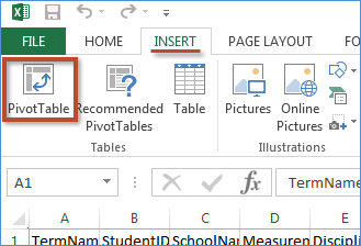
- From the Insert tab, select PivotTable.
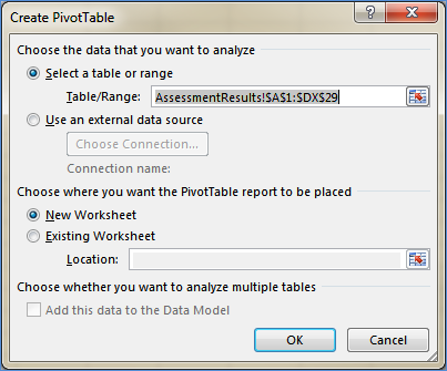
- In the Create PivotTable window, verify that all of your data has been selected. The default settings are usually sufficient. Click OK.
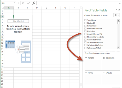
A blank pivot table should appear, with the
PivotTable Fields section on the right. You can drag and drop fields from the top section to the
Filters,
Columns,
Rows, or
Values sections at the bottom.
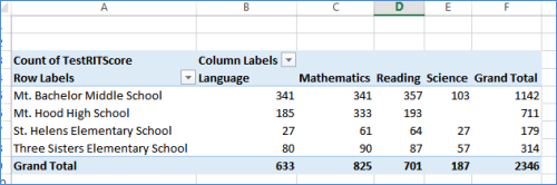
Example table: How many assessments were given at each school?
- Drag SchoolName from PivotTable Fields to Rows.
- Drag Discipline to Columns.
- Drag TestRITScore to Values.
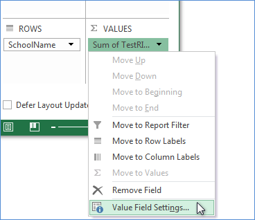
- Under Values, select the drop down menu Sum of TestRITScore and select Value Field Settings...
- Under Summarize Values By choose Count. Click OK.
You should now have a pivot table showing how many tests were administered in each subject in each school, as well as totals.
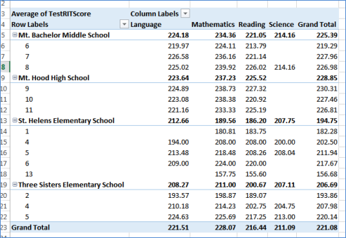
Example table: What is the average RIT score by grade, school, and subject?
This example requires a combined data file (instead of comprehensive).
- Drag SchoolName to Rows.
- Drag Grade to Rows, below SchoolName.
- Drag Discipline to Columns.
- Drag TestRITScore to Values.
- Under Values, select the drop down menu Sum of TestRITScore and select Value Field Settings... (see screenshot in previous example).
- Under Summarize Values By, choose Average. Click OK.
You should now have a pivot table showing the average RIT score for each grade and subject at each school.
For more information about pivot tables, see
Overview of PivotTable and PivotChart reports at Office.com.